Brand Standards
Brand Standards
Logo
Logo Usage
To ensure consistency, always follow the guidelines outlined here when incorporating the logo into any design.
Safe Space
To allow for breathing room and white space around the logo, allow an “&” width around the logo when placing in layouts.

Minimum Size
The sizes below illustrate the smallest size the logo can go in each of its forms without losing legibility.

What Not to Do
The examples below illustrate ways in which the logo should not be used:
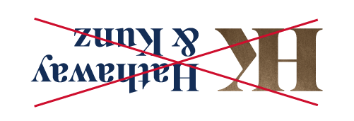
Do not change the logo’s orientation or rotation.
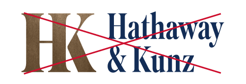
Do not disproportionately scale or resize the logo.
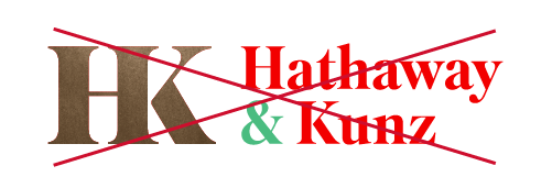
Do not change the logo’s colors.

Do not display the logo with color combinations not previously specified.

Do not add an outline to the logo or display the logo as an outline.
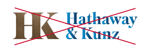
Do not add special effects to the logo.
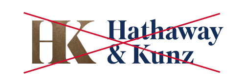
Do not crop the logo in any way.

Do not use the logo on top of busy photography.
Logo Versions
Primary
The primary logo should be used in most use cases. This is the primary representation of our brand.

Full Color

Full Color

Black

White
Badge
The badge variation of the logo can be used for more unique expressions of the brand. It is best suited for situations when the primary logo is too wide for the recommended application. It can also be used as a creative variant for t-shirts, stickers, etc.

Full Color

Black

White
Established
The established logo should be used most sparingly out of our logo family and only when the primary logo is present on the same print or digital material. It should not be locked up next to the primary logo but should instead be on the opposite side edge of the piece.
This logo should not be used in conjunction with the badge logo.

Black

White

